So the deadline has passed and we somehow managed to pull
our level together. Even if the final
product wasn’t exactly what everyone had envisioned, I have to commend my
group, we were all in lab everyday all day and worked really fantastically as a
team. There has been a constant, positive flow of information and unlike the
majority of groups- we embraced asset swapping and working to each other’s strengths.
Jobs were shared and passed around, because everyone was putting in the hours,
no one felt insecure or irritated, so there was no resistance to picking up
other peoples’ jobs. However, there was some downsides to our communal work
methods, for example there were times when working from an unwrap made by
someone else that totally squared me. It didn’t make sense and wasn’t done in a
way that I felt comfortable texturing it, so it had to be done again anyway. But to reiterate, I would happily work with
this team again, we all share the same methods, mind-set and maturity.
While I’m on the topic of unwrapping, I have to mention we
did not have nearly enough planning
for this. Assets made early soaked up a huge amount of texture space because we’d
vastly overestimated how much 10 1024 texture sheets where. Anything made or
unwrapped in the last few weeks which was largely small assets were completely debilitated
by the lack of organisation and foresight we had planning. Assets were forget
and had to be squeezed into horrifyingly small area on the texture space which
left anything other than solid colour blocking completely out of the picture. My
computers for example were the guiltiest offender, they were totally mismanaged
after the modelling stages and by the time it came to packing them there was
literally not a spare inch of space left. But this extended to mostly everyone
assets and because of this lots of the texturing is very low resolution. It’s a huge shame actually because our composition
and modelling were so strong and the left was lit so well that it worked really
well in the engine before textures were even applied, that it was hard not to
be disappointed when our textures weren’t up to the same quality. I think what
we have to bear in mind is that we had a huge amount of assets and very little
time or texture space. I want to say we could have managed our time better so
that more attention could have been dictated to texturing, but I honestly thing
we worked very time efficiently, the larger problem wasn’t working harder or faster,
but instead simply choosing to make less assets or a smaller level.
Onto more positive things though, I think our level layout
and design was really strong and we had great lighting queues to direct the
player in the correct direction, because once again, our level was the minority
in that it was nonlinear. The cylindrical nature meant there was always at least
2 directions to choose and because you had to find a key, all the rooms that
you could choose to enter, including the
empty ones, had a sense of purpose.
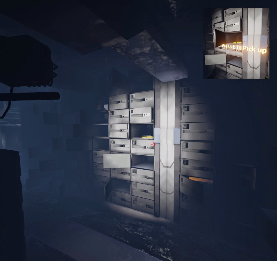
 I had examples last week of the doors all having strong
visual queues using colour, but we also
had subtle things we put in that the player may not even consciously notice,
like the light shining on the key in an otherwise dark room, or the spot lights
on the door. This meant that despite the ambiguity of the path and the explorative
nature of it, the player was still aware of their next ‘goal’: Find the key,
turn on the power, return to the door, etc.
I’m also particularly proud of mine and Jake’s work on lighting,
the atmosphere was very prominent in our level and it was largely down to that,
we had a very keen awareness of lights and light sources from the early planning
stages of the project and that paid off in a big way. We also managed to get
the alternate light scheme working when you turned on the power for a totally
different effect- albeit not as different as we wanted because of the need to
reduce the lights because of lag.
Speaking of atmosphere, our finished outdoors vista shot
Annie did was also super cool- it went from claustrophobic cark to this wash of
bright, open vastness that really contrasted with the interior of the level and
making it feel even darker by comparison. It also sells the context of the
place as when people were play testing our level, upon entering the outside,
most would exclaim- ‘I get it now!’
While I am embarrassed by my texturing this project, it
doesn’t devalue everything else we managed to achieve in this project and I’m
proud of our work and progress, especially when you consider that we put this whole
thing together in 4 weeks. I also
learned a huge amount more engine skills (getting better at engine each
project, awesome!) including matinees which I foresee being a huge deal, since
they are so useful and easy to use, but look really effective and professional.
Also learnt the value of modular parts and how efficient they are, if this is
what we made in 4 weeks, I’m hyped to see what we make in our next project,
that has a generous 12 weeks.


No comments:
Post a Comment