Sunday, 25 January 2015


So the deadline has passed and we somehow managed to pull our level together.  Even if the final product wasn’t exactly what everyone had envisioned, I have to commend my group, we were all in lab everyday all day and worked really fantastically as a team. There has been a constant, positive flow of information and unlike the majority of groups- we embraced asset swapping and working to each other’s strengths. Jobs were shared and passed around, because everyone was putting in the hours, no one felt insecure or irritated, so there was no resistance to picking up other peoples’ jobs. However, there was some downsides to our communal work methods, for example there were times when working from an unwrap made by someone else that totally squared me. It didn’t make sense and wasn’t done in a way that I felt comfortable texturing it, so it had to be done again anyway.  But to reiterate, I would happily work with this team again, we all share the same methods, mind-set and maturity.

While I’m on the topic of unwrapping, I have to mention we did not have nearly enough planning for this. Assets made early soaked up a huge amount of texture space because we’d vastly overestimated how much 10 1024 texture sheets where. Anything made or unwrapped in the last few weeks which was largely small assets were completely debilitated by the lack of organisation and foresight we had planning. Assets were forget and had to be squeezed into horrifyingly small area on the texture space which left anything other than solid colour blocking completely out of the picture. My computers for example were the guiltiest offender, they were totally mismanaged after the modelling stages and by the time it came to packing them there was literally not a spare inch of space left. But this extended to mostly everyone assets and because of this lots of the texturing is very low resolution. It’s a huge shame actually because our composition and modelling were so strong and the left was lit so well that it worked really well in the engine before textures were even applied, that it was hard not to be disappointed when our textures weren’t up to the same quality. I think what we have to bear in mind is that we had a huge amount of assets and very little time or texture space. I want to say we could have managed our time better so that more attention could have been dictated to texturing, but I honestly thing we worked very time efficiently, the larger problem wasn’t working harder or faster, but instead simply choosing to make less assets or a smaller level.

Onto more positive things though, I think our level layout and design was really strong and we had great lighting queues to direct the player in the correct direction, because once again, our level was the minority in that it was nonlinear. The cylindrical nature meant there was always at least 2 directions to choose and because you had to find a key, all the rooms that you could choose to enter, including the empty ones, had a sense of purpose.
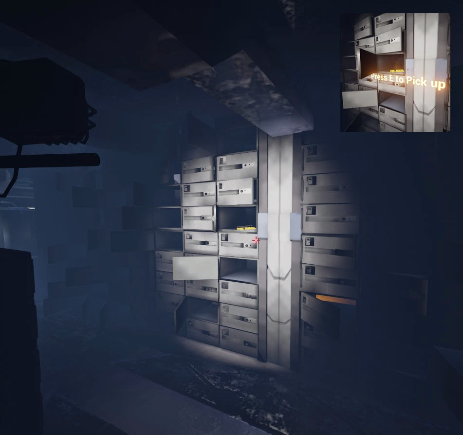
I had examples last week of the doors all having strong visual queues  using colour, but we also had subtle things we put in that the player may not even consciously notice, like the light shining on the key in an otherwise dark room, or the spot lights on the door. This meant that despite the ambiguity of the path and the explorative nature of it, the player was still aware of their next ‘goal’: Find the key, turn on the power, return to the door, etc.

I’m also particularly proud of mine and Jake’s work on lighting, the atmosphere was very prominent in our level and it was largely down to that, we had a very keen awareness of lights and light sources from the early planning stages of the project and that paid off in a big way. We also managed to get the alternate light scheme working when you turned on the power for a totally different effect- albeit not as different as we wanted because of the need to reduce the lights because of lag.
Speaking of atmosphere, our finished outdoors vista shot Annie did was also super cool- it went from claustrophobic cark to this wash of bright, open vastness that really contrasted with the interior of the level and making it feel even darker by comparison. It also sells the context of the place as when people were play testing our level, upon entering the outside, most would exclaim- ‘I get it now!’

While I am embarrassed by my texturing this project, it doesn’t devalue everything else we managed to achieve in this project and I’m proud of our work and progress, especially when you consider that we put this whole thing together in 4 weeks. I also learned a huge amount more engine skills (getting better at engine each project, awesome!) including matinees which I foresee being a huge deal, since they are so useful and easy to use, but look really effective and professional. Also learnt the value of modular parts and how efficient they are, if this is what we made in 4 weeks, I’m hyped to see what we make in our next project, that has a generous 12 weeks.  
It’s this week I realize how awesome modular components are. Our level is huge but we've managed to model and have it function as a game within three weeks because so many things were repeated. It’s also meant we can just model general assets that belong in the universe and then have them make up most of the busyness of the level- for example, computers, trash, bins, chairs, papers. We've actually modeled and abnormally large amount of small ‘population’ assets, to the point where we've literally just tossed them together to make a blockade on one of the corridors. It’s also meant we can easily change paths and routes (like how we made the broken and dangling drop off point last week.) It’s a very adaptable way of working.

Unfortunately it was a rocky modelling week on my end, but it turned out pretty cool I think. Basically I had manually to build a reception room for the level, and the plan was at the time was to make the reception unique and non-corridor based so I made the walls in a different way to everything else. In our presentation shortly after a point was made on some rooms not being ‘containery’ enough for the brief. As a reaction to this I revamped the room and removed all the custom walls and instead dismantled the containers and used parts of them to make the walls instead. So it was literally built out of the containers.

I also put thought into how it would connect with the hallway, so I left in fairings and metal beams so it looked like the wall had been roughly torn out but some of the foundations were still left in, holding the area together. I also thought about how I would light it while the power was down, and made a ‘grate’ which  bridges the lower containers to the stacked containers where the sun will filter through and hopefully speckle nice shadows over the center of the room.


For engine stuff, this week was massively progressive. I learned how to make matinees, which I used to animate all our doors so they automatically opened upon proximity to the player. Unlike blueprints, they were massively simple and intuitive, and with some basic research, you can accomplish some really cool animations. I also had it so lights came on when the doors opened, briefly lighting the next room. Following this, for locked doors, I lit them red and when opened had them change to green. But as much as I praise matinees, they break on a dime and cannot be moved.  This was the kickers as for some reason the engine file had to be changed or moved slightly, so the 20 odd doors I’d individually animated (there is no copy paste) were instantly useless and had to be redone.
The effect was really cool though and made the scene more interactive and immersive for the player. We also go our lights working! I mentioned a few weeks ago that the goal of the level was to make it down to the engine room and turn on the power, which opens the final door and turns on the lights. After getting the blueprints sorted for that (we had some trouble linking it to the door as well as the lights) the issue was that it absolutely tanked our engine. The frames dropped to sub 10 and it was virtually unplayable. This was because having 3 light bulbs in one of the rows to make an even spread of light in each of the columns was too intensive for the engine. Also, and perhaps more importantly was the attenuation raises were huge, and while this gave a great bleached effect, it was too intensive to keep, we also cut one of the lights and settled for 2 per row. This mean the corridors aren't quite as contrasting but it will suffice.

Regardless, it’s worth noting that our level is finally playable from start to finish, with all the mechanics successfully implemented which is a huge relief as we managed some really ambitious technical stuff and it's paid off, including action queues like 'press E to pick up' etc when close enough to an action.


Sunday, 18 January 2015

This week we spent developing our visual understanding of the level through concepts, room and lighting plans. A lot of our planning was actually 3d concepted, I think it’s because for the majority of our group, including myself, our primary strengths aren’t 2d and with a 4 week timeline, we were under a lot of pressure to work fast. It was because of this that most a lot of the very basic room modelling was done over because 3d paintovers were such a crutch for us and have been prevalent as the ‘most efficient way’ of planning a level. It was actually a method I criticized at first, before quickly jumping ship and embracing it.

The different vaults we had planned were loosely assigned for concepting purposes, but it was generally accepted if you had a different idea or an adaptation to go ahead and remodel or paint something, having everyone involved in all the rooms kept the visuals in line so there was no sporadic difference in everyone misinterpreting the idea.  My ‘main’ room was the reception room which I painted various concepts for, bearing in mind that this was the first room the player would see upon playing the level, and also had to have a lighting setup t


hat would frame the large final vault door that was located at the back of the reception. I wasn’t overly happy with the quality of the paintings, but I think the ideas were strong enough.

The far right column was my adaptation of Jake Roddis’ container hallway design, using a mix of already created assets and a new selection of my own, I modelled a hybrid of our ideas which is what we went for. I think I was particularly diligent (to the point overbearing) on hassling everyone about being conscious of light sources and how they could be built into the walls and what not. I like the low lit atmosphere that Jake had created and used them in my first two concepts, but was also keen to try and a largely contrasting bright hallway. We liked both which is perhaps what spawned our primary mechanic. Based on these we decided that instead of collecting a key from the bottom floor, you could go into a tech room and turn on the power, lighting the entirety of the building. This was an idea we were all really excited for, as it would be like walking back through an entirely different level and completely change the spooky tense atmosphere. It was a way to offer a different player experience within the same level which we were all totally on board for.
This week also had big ramifications on the layout plan, we decided the hallway connecting the two layers didn't really work, we also had some pretty detailed concepts and whitebox models of the exterior of the container, but the player never got to see it. We decided to implement a way to interact with the outside so we had it as one of the corridors falling down, dropping you onto the roof of the containers below where you re enter from a hatch. We were fully aware that we were adding a lot more work to our pile when we decided to do this, but it was such a good way to show off our structure from a different perspective- as well as break up some of the monotony of going around a dimly lit corridor in circles- that we decided it was worth it.


It was soon after this change that our main concept artist Annie Wyatt painted our structure from the outside and in context.  This was hugely influential in selling our idea and because the touchstone and reference point for all environments.  It gave our building a bigger feeling of scale, to help ease the burden of modelling and outside environment, the plan is to just use heavy fog with lights underneath to insinuate a city or town below it, with large producing (but simple) towers breaking through the mist. 

Sunday, 11 January 2015

Mash Potato Murder Mystery


Our new brief is up! It’s a group project which I’m always excited for, we more or less reassembled the dream team (Mash Potato Murder Mystery) which was our older Film Room (CTRL ALT DEFEAT) group with the addition of one lucky extra. It’s a nice ensemble where everyone is a similar skill and dedication level so I’d be surprised if we had any issues arise from the group itself.

 ‘The brief focuses on creating a game level where a player will begin at a fixed starting point then journey through the level to a fixed destination.

The player must experience some interaction with the level to allow them to progress to the goal. This interaction could be as simple as opening a door but it must be included.

The main focus of this brief is to:

1.       Make this journey interesting and rewarding for the player

2.       Create a visually interesting environment working within rigid size constraints of shipping containers.’

So this is a whole level project, we are allowed to choose between sci fi containers and dystopian. My initials thoughts on this weren’t particularly strong for either side, dystopian meant we could probably have something totally messed up looking with an abundance of plant life and clutter, sci fi in my mind was a more techy, clean and shiny dynamic. I flicked between which one I preferred for the entirety of the first day like yo-yo in constant flux.

As a group we came up with loads of different theme ideas, these were some of our strongest:

 A journey through a scifi bank

 Creepy science (Dystopian transition into hard scifi)

 A dystopian washed up, stranded beach city,

 Insect infestation, with eggs and what not, that could be applicable to dystopian or scifi.

A dystopian container palace, trashy made nice sort of thing.


We decided the best way for us to quickly explore the potential of all of our ideas was to divvy them up and have everyone responsible for making a mind map geared towards one specific idea. So we shortly reconvened and still didn’t come to any definable answer. As a team we started to quickly sketch our journey and map ideas instead, with very little regard for our themes just to see what shape of level we leant towards and what would adapt well into the design shape. We very quickly grew attached to a cylindrical path. This was naturally more acquitted for a scifi genre map, so we then revisited out original themes and see which one fitted best. The bank was the natural choice, although we did experiment with combining some, like putting the bug infestation or creep science inside the bank, but decided against it.  

This is an early iteration of the map I made based on the sketches, the idea is that it would be a structure with 3 accessible layers, the third layer being the goal, which is blocked by a locked door, and the player must find a way to the lower floor which hides the key. This was our interactive gameplay point, picking up an object to unlock another and proceed to ‘complete’ the level. We also made sure to have blocked corridors to steer you in the right direction and make the player need to backtrack through so that the level feels bigger just by making the most out of what we modelled.

This was a white box made based on the map and sketches. All of the rooms are on the inside because it didn’t make structural sense to have them on the outside, however the corridor on the outside looks jaunty and out of place, luckily since you don’t go outside, it isn’t really to much of an issue what it looks like, as long as it feels right from the inside.

This lead us to our next discussion though, what justification was there for a sci fi container made bank? Our ideas matched the art direction examples we were given, but we couldn’t think of a reason this structure would exist in a world. We came up with a world that was set in a future that had descended into dystopia, so while the tech and design is there, the idea is that it’s massively degraded and is being inhabited band used like a slums, put together with salvaged containers from whatever scifi transportation thing it was before. We were reasonable happy with that explanation but it still left us a little uncertain of our context in the world, the story also has a tendency of changing depending who you ask. It will all become clearer when we have some concepts.   

Wednesday, 31 December 2014

Christmas Update


Just keeping you updated on a small Christmas venture. I wanted to work a little bit on my environmental concepting, however I realized I was having trouble with idea generation, this was probably because I didn't have any specific idea in mind of what I wanted aside from 'fantasy landscape'. Almost miraculously a few days later FZD released the absolute perfect video on idea generation. It basically was using photo bashing as a technique to generate loads of completely different landscapes. I gave it a try and they came out really cool, but I think I may have relied on the photo bashing too much and painting over them not enough, so there's still work to be done here. I still thought it was a really interesting tutorial though, and when we inevitably have to do some sort of landscape design in the future, a technique like this might come in useful. 


https://www.youtube.com/watch?v=P-l9kNXAeGQ

Sunday, 21 December 2014

Lessons Learned

“It’s failure that gives you the proper perspective on success.” - Ellen DeGeneres
This last four weeks have not been my best, but there's allot to be learned here as well. This project certainly didn't leave me on the high note that my sentry turret or film room did, but the best thing to do at this point is salvage everything there is to be learned from it and  then try not to dwell. 
So let's see now; my finished model ended up something like this: 

Lesson1: The absolute most important lesson here is the importance of orthographies. I tried to model a stylized character from a real person. I believed that I'd be able to adjust it on the go and I was wildly wrong. If I had more time, maybe I could have pulled it off, but I didn't and I should have known this at the time I started modelling. If I had followed my design more closely, I would have been able to pull of a much more unique and stylized character like the ones from my designs. The hunch for example- I always told myself throughout the process that I would achieve posture through rigging, but being left with no time for such a glamorous stretch goals, my character lost instant personality though not being hunched over, with dangling, ungainly arms. 

Also the shapes! My design hinged fundamentally around being sharp, jagged and harsh. Where as this came out being rounded and friendly- again I put this down to not having proper orphographies that I could model too. The hood in particular stands out as a big thing that should have been very different.
 I mean, look at the difference in silhouette that should have been.

I really find it strange in retro respect some of the decisions I made, there are very simple design mistakes that could have vastly improved my character. I mean- fundamentally, I don't think the model was bad, it just not what I had designed. In fact, technically I feel it was quite adequate.


Lesson 2: Time management. I don't want to make excuses for myself, but it does have to be mentioned that I lost a huge amount of time designing and re designing in the early stages of the project because of how vast it was, and my own uncertainly on what I wanted or what was expected of me. But despite this, there are some weird things I got caught up doing while modelling. The hands for example, are laughably detailed compared to the rest of the model. Ironically I do really like them, it just wasn't an appropriate use of time. I also was left with tragically little time for texturing- which kind of ties into the next lesson.

Lesson 3: I needed way more texture planning.

After doing some colour studies and colour themes, there was a lot of colour work done premodelling- thing is, I knew I didn't like any of them in advance. I was just hoping as I textured something good would happen. But while the colour scheme was far from ideal, the bigger problem came with texture style. My original style plan left colours in a painterly, simplistic fashion.. The problem with that was, that wasn't my model anymore. Instead of the model I was supposed to have- I had a semi realistic that looked outright unfinished with the simple textures I had planned. So I kind of made it 'half realistic' texturing in an attempt to adapt to my new model but also stay loyal to my original plans. I didn't get the best of both, not my a long shot, I think I got the benefits of neither and it ended up looking like it really didn't know what it wanted to be. Which it didn't.

Lesson 4: Making sure you understand the brief. I can't stress enough how much simpler things would have been this project if I'd have just got the project more. Especially the dichotomy parts of it. I'm not happy with the design I went with and now that it's too late I can think of a million other awesome ideas for dichotomous characters, I have one particularly specific one about a sports bike rider- tall, edgy and fast in a full leather race suit, compared to short, round, half helmet cruiser or Harley rider- two stereotypical enemies in the motorbiking world. It would have been fun to play on those sterotypes.
In a strange way, now that I've written this post, it's like I've made peace this project and can just embrace the lessons learned and move on. It's almost pleasant.


Sunday, 14 December 2014

Queue Panic


My characters aren't dichotomous. It took me drawing out my 'final' designs to realize it, but I have. 

Queue panic.
I immediately tried to adapt my designs to be more contrasting, I experimented with cute/creepy, smart/dumb, and other opposites that could be applied to by already existing designs. I tried rolling with cute/creepy but by the time I was finished I was sick with dread on even justifying it as a design. It felt like it lost all it's character and charm. I didn't like the robot as a scary character and likewise the girl who was representative of darker and more unsettling characteristics herself. 


I backtracked and tried to just work with what characteristics they already had and just reemphasize them more. I think I settled on a sweet spot- cynical and tired verses young and wide eyed. I think this comes across despite one being a robot... I also tried to make better use of shapes; sharp and hard edges and smooth round curves to create more dichotomy. For a quick fix I think there is some significant dichotomy, I only wish there was more time for me to draw the pair out nicely, but even without our (very much appreciated) weeks extension- there's still no time. I'm already way to far into the project to still be concepting but the redesigns took out a huge chunk of this week that should have bee spent modelling.  I'm still trying to claw out of this deep self loathing 'I missed the point of the project' pit... again! This is clearly not my project. 
-

In between choosing which ideas I hate the least, I also managed to put together some colour themes. I thought it would be a nice step to have before colour schemes, basically just gathering a load of images that had a nice palette, so I can get an idea of what colour scheme I want to use. I asked people around which ones they like so I could work in on a few of the popular ones.
A particular design choice I made to help enhance the dichotomy was to have the two at contrasting ends of the colour wheel, only to be connected by the girls arm which would be made of the same material and colour as the robot- to bring the design together as one unit. I like to think that they do look like they belong together in the same universe because of some shared features like the eyes and strong use of triangles.

In the meantime I finally started modelling, and with no proper orthographies to speak of, I'm using an actual person for proportional values so I can get them correct and then edit them to match my designs. I'm finding modelling clothes particularly difficult and am having some troubles keeping it low poly, I'm also at a stage where I have no idea how I'm going to do the fur or hair. On one hand I think using alphas wouldn't look as effective or adhere to the design as much, however it is a more standard and budget conscious method I think I need to be wary of this as the tri count is looking quite high already.
It was also incredibly irritating to do the trousers which are supposed to be incredibly baggy and add allot to  the shape, but I ended up having to neuter them down significantly because it kept clipping between the legs, ruining any future rigging potential. Also when I tried to make them larger on the outside, it looked ridiculous.


I had more luck with the head, which I am cautious to say I'm quite pleased with, but I'm apprehensive because maybe my standards have been lowered so viciously that any small victory seems like an enormous relief. I liked that I managed to get the stylistic nose tilt that makes the character look younger, it also makes the big round eye sockets even larger by comparison, which is good since the eyes are meant to unsettle you, in contrast to the almost 'cute' face.

Next week will be a huge push to finish the whole thing, it's disastrous that I'm even this far behind in the first place, but |I don't feel it's impossible just yet, as long as I keep up the pace and finish modelling within the next day or so. There'll be some late nights, I can tell.

See you next week!