a division or contrast between two things that are or are represented as being opposed or entirely different.
"a rigid dichotomy between science and mysticism"
A character project, finally! Or so I thought anyway, it was a weird first week. Designing characters is normally one of my favourite things to do, or at least it certainly was pre-uni. I suppose since then my interests have shifted more towards environmental work or maybe I'm just a bit put out by how this week as gone.
Let me start by saying that this brief is open, and while I can see how some people would -and do- love this, I think I speak for the majority when I say that maybe it is too open. For starters there's no tri budget, texture budget or style restriction. This is the first project we've ever had of this nature (It's our second character project ever) and it's... intimidating- ps we need to design two characters. It's intimating and I think I had a bad reaction to that much freedom, I immediately went into panic mode and started to choose themes to help narrow it down, I started moodboarding for tribal and sci-fi, two totally different types of character. After our reviews, I realize how terrible of mistake this was, and I think it's because I misunderstood the purpose of the project, I was far more preoccupied with what I wanted to make rather than just silhouetting and having a unique character jump out at me. I was too threatened by the very short 3 week time period and I specialized too quickly into a design I didn't want.
I don't exactly dislike this page of designs, I just feel embarrassed by my total misinterpretation of the brief. It's all about the designing process and I skipped over a huge part of it. I was advised (to put it lightly) to, effectively start again. I can see the logic to this now, but there was a raw spot after those presentations where the whole year was collectively seething, we felt cheated and tricked. While I'm completely aware of the mistakes I've made so far this project, there is something to be said about the brief itself for allowing us to collectively get it so wrong.
Either way, time to reconsider.... everything, and get this thing back on track. I'm going to make the effort to put more of my attention into shape and silhouette appeal, rather than detail.
So overall I like my turret, I feel I attempted a difficult but unique concept and achieved all of the learning goals I set out to achieve in this project. But there's always things to improve on, and now that I've finished, here are some of the points I don't think I've mentioned in previous posts.
Okay, my main grip was my texturing, I feel my maps were strong and the roughness metal map worked super well with each other to make scratches, paint and rust, some of the materials don't read great. I think it' s because I wasn't sure what exact material I was going to use, even while I was making it. All I knew was it was some kind of plastic fairing material. I'm referring specifically to the white armored bits around the turret, I feel as though if I knew what exact material I wanted, I could have nailed it, but I was really just guessing. It could have done with being higher contrast with the metal for sure. Again this dates all the way back to my concepting phase where I should have done more in depth value studies and that itself might be the route of the problem.
Also seams, there were some... rough seams on that model if you knew where to look, I should have spent more time smoothing over them definitely. Also there were some areas of texture that in general weren't up to standard, but in fairness, those are areas the player wouldn't get to see, like top of the wings and bottom of the gun, but regardless it would be in good practice to bring those up to the same standard as the rest of the gun.
Another little misadventure I had was with Zbrush, which on reflection really just wasn't necessary. But at the time I just wanted to try it, so, that was that. But anyway the problem I had with Zbrush was because my model wasn't perfectly symmetrical before importing, I couldn't use the symmetry tools to get nice equal details on both sides. Weirdly enough though, after I went back into max and redid the symmetry line, Zbrush still didn't like it so I ended up just painting once side then copy and pasting it on the normal map.
Here's one I know I mentioned back on my concepting post, but it's still really prevalent. I think the weakest part of my model was the texture design itself, even if I did salvage it slightly by stylizing it half way though the texturing process. I would like to avoid this in the future and should give it far more attention in the early stages. what I needed was a good single value painting, so I could do a bunch more good looking designs faster, I could also have experimented with some higher colour contrast designs.
Going to reiterate again though, that I do like my turret. I think it's a pretty cool design and will definitely be using a similar silhouette/bash kit based work flow again in the future.
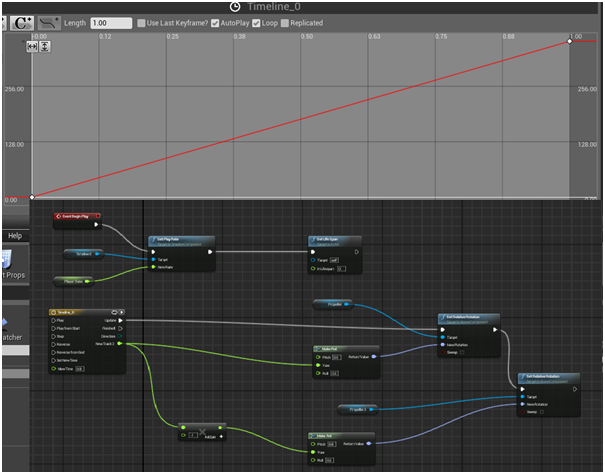
Blueprints. Man, this week has been awesome, I've got everything functioning correctly and it really ties the turret together, it looks all techy and ready to go. I was very concerned at some points, because there were some low moments where I wanted to give up and walk away from rotation blueprints. Side note- you would think that of all the simple things to have, Unreal 4 would have a single node or two, that asked: 'rotate on axis/pivot? Great, what speed?' And that would be it, done, neatly wrapped and taken care of in a few hours work. That would be way too convenient though, instead it was a grueling week of trial and error, it really doesn't help that because this version of the engine is brand new, resources are scarce, there was no tutorials that had what I needed, so I was working from the ground up. In retrospect, this really taught me more than a tutorial would- I know exactly what every node does and why it's needed, and that's probably what got my next- far more glamorous- blueprint working as well- however I bet it could be done with half the complexity, oh well, fake it till you make it.
So all's well as long as those propellers rotate, Which they do- ha! I'm so pleased!
Oh- also: DMU 3rd years absolutely rock, they helped me out loads getting these things going and showing me how to work timelines. Really appreciate it!
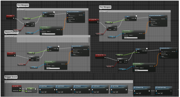
I also got the bullets shooting out of both barrels, which was some pretty simple stuff, although it did give me some really weird bullet problems. There was a whole day spent constructing and reconstructing my turret because my bullets weren't firing. Turns out the second barrel collision box was screwing with where the bullets spawned, so they weren't going anywhere, so I had to remove the collision on the barrels, and I staggered where the two bullets spawns were for each barrel so they didn't collide with each other and make a terrible mess. Getting the gun working was pretty sweet though, it felt more powerful than the single and helped compensate for my tiny puny bullets.
Putting sound on there was also way easier than I thought it would be, though it is obnoxiously loud so headphone users be wary, just a cool stretch goal I managed to grab before hand in. After that, I thought I was done, it wasn't until I was sitting in labs on hand in day when one of our tutors- Max- was checking everyone's turret out. He looked at mine and mentioned how cool it would be if I got it to move around the scene. I asked if he was serious and he gave me a laugh and told me to try. I'm still not sure if he was joking, but with a few hours to go, I decided to give it a shot regardless. I didn't expect anything, I'd spent a week trying to get propellers to rotate, I couldn't get this thing moving in a few hours... TOTALLY COULD, TOTALLY DID.
The turret now follows you around at a slightly slower speed so the player can kite the turret and keep out of range, or choose to engage. It will also always rotate around you to try and stay in front of the player. I felt like a total pro after getting it working, maybe the hours could have been techincally better spent polishing textures, but the blueprint and overall confidence boost this gave me I feel- on a personal level- was way more valuable.
So project over- feel good, bring on the character project.
Edit: Bonus video, sans sound, because I'm completely inept at video making, but you get the picture, in fact, you get the whole video. Hahahahahha
Edit2: Noticing it's not showing up on preview, if it doesn't for you either, here's the link;
The modelling process was
everything I feared it would be- I had to shave off certain elements of the
turret to help preserve the delicate tri budget (Including those delicious side panel gun things, which will be mourned) and the circular nature was
making topology tricky.
Also it came out a little less angular and sharp than I had hoped it it would look, but it did match my concepts, so maybe it just me. I think I could have elevated some of the modelling
weight by using different objects to make up larger portions of the mesh,
instead of building everything from one. This not only was more expensive
triangle wise, but also gave me some strange loops that had to be manually
sorted out later. I’m noticing this as a
trend in my modelling lately and think it may be worth addressing- I’m much
more inclined to model objects from one piece of geometry rather than use lots
of simple shapes to ‘fake’ a single object. There are arguments to be made for
both sides; modelling from as single object leaves less seams and strange inconsistencies where the objects meet. But also having everything from one
means the topology is messier and more difficult to edit.
I also had to change my idea for the pivot. I overlooked it in the design process because it didn't occur to me at the time, but the gun would also have to move up and down. My design flies- because of this it never even crossed my mind that instead of the whole machine moving up and down, the gun itself would have to- as per the brief. This meant i had to adapt from my flat purely horizontal rotation system (which didn't work anyway because I'd designed the gun at a slant, and it just didn't look right facing straight on, because then it doesn't make sense that it flies and- well you get the idea. I oopsed it. It didn't take much to adjust the design, which I did begrudgingly and with a deep set loathing for the way it made my turret look like it'd taken far too many diet pills and was bitterly missing some chunky goodness in the middle (clipping issues lalalala I can't hear you.) EITHER WAY, it works now and that's what it needs to do. Maybe the sleek look will grown on me... yeah probably not.
It was pretty reminiscent of some of the concepts I'd turned down for not being turrety enough, or would be unable to rotate without aiming at itself, basically any of my designs that had too much decoration than hung out over the sides and went beside the gun. Also ruined any chance of having propellers on the bottom as well as the top- because how cool would that have been? I thought I'd already thought out the technical side of it but apparently not, I put a pivot ball in there instead, because that's a pretty legitimate solution to anything ever.
I mentioned earlier that I wasn't completely satisfied with my textures, this only became more apparent
during the texturing process. I found it challenging to work with white clean
surfaces like I’d planned. It simply looked bland. I tried changing the hues to
adapt to the problem but then it simply looked odd and lost the clean appeal it
had. However I decided something need to
be done so I started adding rust and scratches around the entirety of the model
and then revamping the entire style to embrace a comic-esque, outlines style and
everything came together. The rust and scratches worked great with the
outlines and the characterization of the turret was shifted
from military and clean, to battle worn and fierce. I thought it was an entirely
suitable change that still kept the core theme in check- predatory.
Having a bash kit for the Sentry Gun project was awesome.
It was a fast and efficient way to
identify and distinguished and unique shapes from pre-existing objects, and
them mixing them all up to get a whole page or unique shapes. Even if an object I used was overall simple
and uninspiring, when made into a silhouette it could be anything. I found the
most interesting shapes to be insects and birds- this made it easier to
‘personify’ the sentry turret with sharp edges to make it more predatory and
menacing.
One aspect I honed in on very quickly was that I wanted my
turret to fly, float or hover in some way. I felt this made it stand out more
since I noticed that the vast majority of people had stuck to the basic format
that we were given: base, pivot, gun- in that order. I wanted to change things
around a bit. All I had to keep in mind is that it still has to function in the
way the brief describes, and I was confident I could still make that happen.
A downside of the splicing was I got pretty carried away- I
got too elaborate with the designs that were very complicated by nature, and
was torn between a design I loved, or trying to find something more suitable
for the triangle and texture budget allocated. I danced around with whiteboxing
and decided that some of my designs were unreasonable. Despite this when I
asked my peers their opinions, the general consensus was overwhelmingly
positive for the complex design. So I decided to try and merge some together to
retain the essence of that design, but make it more appropriate for the task.
One of the other big decision I had to make this week was if I was going full out sci-fi hover turret, or a more standardized 'heliturret.' The major distinguishing feature being a choice between propellers and energy balls things. I've never gone into too much depth with blueprints yet, but there's definitely a want there. Not going to spend another project drooling over emmisives. I've begun to notice that's what's setting the year apart as well, engine value. It's new and shiny and cool as beans and I want in.
I went with the propellers because I decided I wanted to keep this design relatively grounded because I found myself leaning more towards the mechanical part of 'bio-mechanical' and want to embrace that theme.
Finding a nice colour scheme was a lot more uninspired than the design
itself, they all felt lack luster. I referred back to mood board colour
palettes but found it equally fruitless. It was probably the weakest part of my
design conceptually and was a real damper on my overall excitement for the project. I’m sure more could have been done with the colours, but
time was of the essence and a decision had to be made me. I went with a simple,
muted selection because I felt the subtle and reserved colours fit the
atmosphere of the design adequately, something reminiscent of military
helicopters and jets, with the white/grey plating that looked like a modern suit
of armor. I also added in some contrasting yellow for flavor, impact and indistinguishably. Either way I'm not married to the colour scheme and if I think of something else while I'm modelling, I may just embrace it.